Watch Our Product Tour
See how BigCommerce helps you build and manage your online store with ease.
- Ecommerce Insights
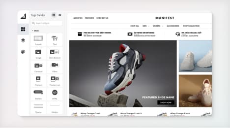
6 Key Steps to Launch Your Online Store
Explore our Launch Foundations series to get your BigCommerce store up and running quickly.
BigCommerce helps growing businesses, enterprise brands, and everything in-between sell more online.
Navigation mistakes to avoid
Of all the factors that contribute to success or failure in ecommerce, nothing is more important than your website navigation. You have one shot at a good first impression, and users are not likely to come back if you disappoint them. Good navigation requires focus on two unwavering goals: getting users to where they want to go, and getting them there fast.
If they can't find what they are looking for quickly, all of your marketing efforts will suffer, including traffic, search engine rankings, lead generation and sales. Here are some common mistakes you should avoid.
Navigation that is 'too creative'
When people visit a website, they expect to find the navigation in one of two places. They look for a horizontal row across the top or a vertical column in the sidebar (1). Placing the navigation where people expect to find it will help them to move around the site with ease. This will reduce your bounce rate and increase your page views.
Using non-descriptive text
Examine your navigation labels and ask yourself how well they communicate with your audience. If you are an apparel reseller and your navigation uses a generic term like "Products" instead of "Women's Jeans," you are making it harder for the user to find what she wants. Focus on using descriptive phrases that allow people to get to your products using fewer clicks. Instantaneous communication is not only key for user experience, it can also impact search engine rankings. Navigation links are an important component of how search engines understand the composition and meaning behind your website. Use good search terms, and you will earn increased attention from both users and search engine spiders.
Distracting menus
Drop-down navigations are usually a bad idea. Search engine crawlers often cannot read them, depending on how they are coded on your site, and some studies say users find them irritating. When someone moves to click on a navigation item and suddenly sees a list of drop-down options, it stalls their progress. Drop-down menus also discourage traffic from high-level pages that often contain important information users might otherwise miss. Despite these problems, drop-down navigations can work well if your website is so large that users need them to find sections they are looking for.
Like all other visual media, the same rule applies - less is more. Some experts believe that the number of navigation items should not exceed 7, due to the limits of short-term memory.
Compare a website built in 2015 with one from 2005. What are the major differences you see? The newer website likely has fewer links on the page, as well as a simpler design. Web developers have learned over the years how human eyes are easily overwhelmed by competing page elements and navigation items. Every time you remove an item, you are drawing more attention to the most important menu items on your site.
Another benefit to a simplified navigation is the "link juice" your homepage passes on to interior pages. By including fewer links on the page, you are passing more authority on to top-level pages that are important to your search engine optimization efforts.
Using graphics instead of text
Graphic buttons are a rarity in navigation schemes these days, and that's a good thing. There are several reasons why using buttons instead of text is a bad idea.
Search engines cannot read images. Yes, you can attach alt image tags to your graphics to help visibility, but when it comes to SEO, there is no substitute for simple text.
Graphics are not versatile. If you want to update menu items you will have to redesign the button, which is cumbersome.
Scanning programs for visually impaired people will have difficulty reading your graphics.
Not prioritizing the menu order
Read any list left to right once, then look away and try to remember what you just read. Studies show retention is the highest for the first and last items on a list. Likewise, you should consider the most important links on your site and "bookend" them in your navigation. Most websites feature the "Contact Us" label on the far right, one of the most important pages on the site.
Website navigation is an often overlooked, yet critical component of online marketing. By simplifying the focus, using descriptive text and predictable placement, you will create a conduit that gets users to their goals fast. You might even consider testing a few navigation and page layouts with some of your best customers. Get their perspective on how well it works, and you will be well positioned to launch a focused, sales-ready website.
1. "Are You Making These Common Website Navigation Mistakes?"
BigCommerce helps growing businesses, enterprise brands, and everything in-between sell more online.
Start growing your ecommerce business even faster.
High-volume or established business? Request a demo