Best Product Page Examples to Drive Conversions and Sales
Get The Print Version
Tired of scrolling? Download a PDF version for easier offline reading and sharing with coworkers.
A link to download the PDF will arrive in your inbox shortly.
Key Highlights:
As competition continues to grow in the ecommerce space, product page design plays an increasingly important role for retailers looking to engage customers and drive sales.
Product description pages (PDPs) must tailor information to serve three key audiences: shoppers, search engines, and AI agents.
In order to effectively build trust with shoppers, online stores should stay up to date with design best practises, providing clarity via accurate product descriptions, hi-res visuals, and easy routes to purchasing.
The most successful businesses optimise information along the entire customer journey, and personalise the shopping experience for their target market.
User-centred UX design and informative product pages that reduce uncertainty surrounding products are now easier than ever to create and maintain.
It’s clear when shopping online — not all websites are built the same. High-quality product content plays a critical role in online purchase decisions, ensuring shoppers can trust a brand and its products. Without providing content that informs and builds confidence, you may experience higher bounce rates or even shoppers abandoning their carts.
A product page contains the essential information customers need when evaluating an item. This includes a description, item specifications, images, pricing, and FAQs, which together form your main value proposition. The best product pages can help overcome the disconnect that naturally occurs in online shopping, helping customers who can’t “try on” or see the product before buying it.
Here are a few key ways product pages support your business:
Provide detailed product information: The page should include essential details about the product, such as features, benefits, dimensions, and specifications.
Build trust: Well-crafted product detail pages anticipate questions or concerns customers may have — minimising doubt regarding their purchase.
Encourage conversions: Educating the customer, building trust, and highlighting product features and benefits increase the chances of a sale.
When building an ecommerce store or migrating to a new platform, it’s essential to design product pages with your customer in mind. Clear information, intuitive layout, and compelling copy all work together to reduce hesitation and support confident purchasing.
This step-by-step guide will walk you through optimising your product pages to create a stronger, more effective online shopping experience.
Get a free 15-day trial of BigCommerce.
No credit cards. No commitment. Explore at your own pace.
Essential ecommerce product page elements
Effective ecommerce product pages have a few things in common: a clean layout, keyword optimisation, and thorough product descriptions.
Customise the user journey.
A well-designed ecommerce product page personalises shoppers’ experience by offering product recommendations, displaying the most relevant information according to the user’s search intent, and optimising the layout for the user's device.
For example, if a customer is browsing for a particular product feature (e.g., “self-cleaning cat litter box”), the page can highlight that feature and provide in-depth information about it. This can improve the customer experience and drive the likelihood of a sale.
Live chat support.
No matter how thorough your product page is, you can’t anticipate every customer question. Live chat support, including a homepage pop-up, enables customers to receive immediate answers to their queries — boosting satisfaction and trust.
If a potential buyer has to email customer support and await a response, this creates a communication barrier and increases the likelihood they’ll purchase from a competitor in the meantime. A quick, practical solution increases the chances of a sale.
Detailed product information.
Great product pages contain comprehensive information about the item. The page template should be structured in an easy-to-read format, with relevant information presented in logical order.
Here are the key elements of an effective product page:
Product description: Includes all essential details about the product, including its features, benefits, uses, and specifications. This includes measurements, dimensions, materials, and care instructions.
Product images and videos: Include high-resolution product photos and videos that show the product from multiple angles, so the customer understands how the product looks in real life. These enable customers to zoom in and out of images.
Product variants: If listings have multiple options on the same product (such as colour variants), consider listing all variants on the same page for better visual merchandising.
Product configurator (if applicable): This allows customers to interact with a 3D-rendering of a product and apply features such as colours, materials, or upgrades. This functionality is ideal for customisable items.
Pricing and availability: Include taxes, shipping, and other applicable fees, plus available discounts or promotions.
Customer reviews and ratings: Positive customer feedback provides social proof and boosts credibility, helping customers make an informed purchase decision.
Product comparison: A comparison table shows how the product compares to similar goods in terms of features, benefits, and cost.
Warranty and return policy: Explain the warranty and return policy to help customers feel confident about their purchase and reduce the likelihood of returns or disputes.
Frequently Asked Questions (FAQs): Provide a list of FAQs to save customers the trouble of contacting customer support.
Product configurators.
A product configurator is a software tool designed to customise products that satisfy each shopper’s unique preferences. Product configurators let consumers make real-time adjustments to variants of a product, which can include the colour, size, features, and materials. Your audience can watch these features change and come to life on their screen.
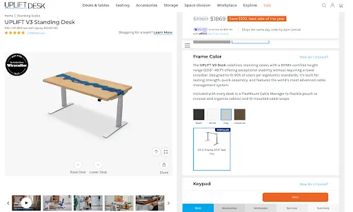
Some product configurators allow customers to build a complex product from scratch, combining different components to create a fully customised setup, like UPLIFT Desk’s desk builder. 3D product configurators take this a step further by offering a more immersive shopping experience through third-party apps that integrate with platforms like BigCommerce, such as Zakeke Customiser.
Product configurators can be web-based or integrated into a store’s ecommerce platform, which allows for a seamless user experience across multiple platforms.
High-resolution visuals.
It’s no secret that crisp product photography can increase conversions.
“67% of shoppers cite image quality as the top factor in their buying decisions.” — Product Photography Statistics 2025
High-resolution images show product details and features easily, giving a glimpse into product quality. Customers should be able to see the quality of the stitching on a clothing item, or a gem’s lustre.
Here are the types of product images you should include:
Product-only images: Show the product against a neutral background, free from distractions.
Lifestyle images: Show the product being used in real-life scenarios. These help customers visualise how the product would look and feel in their own lives, along with its perceived value.
360-degree images: Let customers view the product from multiple angles by rotating imagery.
Infographic images: Use graphics and text to highlight specific product features and benefits. Infographic images can be used to communicate complex product information in an easy-to-understand format.
Product variants.
Displaying product variants can be another way to show a diverse range of options, whether that’s the colour of a shirt or the dimensions of a desk. As shoppers click through variants in a listing, they change, letting them compare different options without having to switch between tabs, other pages, or shop in-store.
A good rule of thumb — if it’s the same product with more options, include all product variants on the same product page.
Shoppers can view product features via dropdown menus, which allow stores to display variants with many options like size, colour, and materials. For items that could use more detailed images of variants to supplement main product photos, swatches are an eye-catching way to show a product has more options, such as a shirt in multiple colours.
For swatches it’s crucial to upload visually-appealing thumbnail images, ensuring all of the same dimensions align with each other. Different sizes and askew layouts can make a page feel disorganised.
And it’s also just as important to include accurate and clear product titles and descriptions, including variant-specific details in the title.
Stores with an older website design tend to break out each product and variant into separate listings. This frustrates shoppers and slows them down in their search. Modern ecommerce platforms and product-variant tools solve this by streamlining the experience and helping customers find what they want faster.
Accessibility features.
Ensuring your online store is accessible is key to being successful, both now and in the future. UX design that includes features that make it easy for shoppers to navigate and gives them alternative ways to view information puts your products in front of more people.
It starts with including accurate alt text for all images, which lets shoppers “see” an image via descriptive copy. Make sure your site allows for keyboard navigation and tools like variant selectors that can be used with keyboard shortcuts.
Accessibility in ecommerce also includes readable font sizes for mobile devices and for desktop. Sufficient contrast for text must also be taken into account, since colours that are too close together on the colour wheel make product pages hard to read. For example, buttons like “Add to Cart” and “Buy Now” should be large enough and designed with contrast, so the action is clear to assistive technologies.
One of the best ways to promote web accessibility is ARIA (Accessible Rich Internet Applications), which helps with assistive technology tools such as screen readers and magnifiers. This allows individuals with disabilities to explore digital spaces with equal participation.
ARIA accessibility should be considered when displaying dynamic content, like images and info on variant updates, too. Thankfully, there are third-party accessibility tools that help, and can be easily integrated into site designs to ensure everyone is getting a richer experience.
Pricing incentives.
Pricing incentives reduce barriers to purchase. Incentives can be used to reward loyalty, or inspire a first-time purchase.
Ecommerce businesses typically use a combination of incentives depending on the customer’s purchase history, average order value, and recent activity.
Here are a few examples of incentives that work:
Discounts: These can be percentage-based (e.g., 10% off the purchase price, or a fixed amount like $20 off).
Limited-time offer: Offering a special price for a limited time creates a sense of urgency.
Free shipping: Free shipping is an ideal incentive if the shipping cost is high, or the product is heavy or bulky.
Buy One, Get One (BOGO): This offer is ideal for items purchased repeatedly or in bulk (e.g., dish detergent). You can offer a free product with purchase, or a discount on a second product. Bundle offers are also effective for this product type.
Loyalty discounts: Encourage customers to join your loyalty programme and make repeat purchases.
Price-match guarantee: Offering to match your competitor’s prices encourages customers to buy from your site instead.
SEO optimised.
Product pages must rank in search results so customers can see your product offering when they search for corresponding keywords.
Use a keyword research tool to identify the keywords (e.g., “laptop”) and long-tail phrases (e.g., “best gaming laptops under $500”) so your audience can use these to find your product. Insert those keywords in the page’s URL, title tags, meta description, product name, and product description.
Here are some other page elements you can optimise:
Page headings: Use H1 tags for the page title or main heading, and H2 tags for subheadings. Frontload keywords to enable search engines to crawl the content.
Product images: Use relevant keywords in image file names and alt tags.
Customer reviews: Search engines view user-generated content as valuable, boosting page ranking.
Schema markup: This is the structured data search engines use to characterise page content. Provide product metadata such as product title, description, price, category, and SKU.
Page load speed: Ensure the page loads quickly, as this is a ranking factor for search engines, and directly affects conversions. A site that loads in one second has a conversion rate three-times higher than one that loads in five seconds.
Link to social media: Tie your social accounts into your page design, or link them in the footer of your site.
Agentic checkout.
Ecommerce shopping is changing fast, and as AI-assisted shopping and agentic checkout increases, businesses that stay on the cutting edge of technology can stay ahead of the curve. This means building your product pages and ensuring data is formatted correctly for artificial intelligence and its tools.
How agentic checkout works:
Intent capture: Using past searches and buyer behaviour, AI builds a clear picture of the shopper’s intent, and sets the purchase journey in motion.
Product selection: AI agents search across multiple channels, storefronts, and product listings to find the best match, weighing factors like brand preferences, size, availability, delivery timelines, and price.
Checkout optimisation: After selecting the product, the AI agent streamlines the checkout experience by choosing the most relevant payment method, fastest shipping option, and applying discounts.
Secure payment execution: AI agents initiate a secure, compliant transaction via tokenized payment methods, and integrations with trusted providers like Visa, Mastercard, PayPal, or Google Pay.
Post-purchase engagement: Agentic checkout follows up after purchase to support the customer with real-time notifications for order tracking, delivery updates, and proactive support.
For retailers, agentic checkout simplifies backend workflows while simultaneously enhancing business performance. By enabling real-time inventory and price optimisation, businesses can dynamically adjust offers, and product availability.
Websites and retailers that build their product pages for AI-assisted checkout also create new chances for upselling and cross-selling — leading to higher average order value (AOV). With operations getting increasingly more automated, teams are now free to focus more on strategy and growth.
Premium shipping alternatives.
Offer options beyond standard shipping for customers who require fast delivery, such as shoppers buying last-minute gifts for the holidays or those purchasing from abroad.
Here are a few premium shipping alternatives to consider:
Expedited or same-day delivery: Same-day delivery is ideal for fast-moving consumer goods such as groceries and other perishables.
Weekend delivery: Some deliveries require sign-off from the recipient. Offering weekend delivery is a good choice for customers who need items delivered on a specific day.
International shipping: Shipping overseas is a good choice for customers who are unable to find the products they need locally.
Premium packaging: This option may include gift wrapping, custom packaging, or other special touches. This is especially important if you ship fragile items like wine bottles or artwork.
A/B test product page designs.
With so much at stake with running an ecommerce business, no good idaea or web design feature can be left out. Test different versions of your product page design and measure the success of each, ensuring conversation rate optimisation (CRO).
Elements to A/B test on your product page include:
Hero image vs. product video
Long-form vs. short-form product descriptions
Sticky CTA buy bar vs. standard CTA
Continuous scroll vs. tabbed sections
Ebook: Win Customers Across Every Channel
Get expert insights on data, branding, and marketing strategies to grow sales on every major ecommerce channel.
Differentiate for B2B product pages
On the other end of the selling spectrum are B2B product pages. According to eMarketer, B2B ecommerce site sales grew 10.5% year-over-year in 2024, reaching $2.297 trillion. Businesses that invest in ecommerce sooner rather than later are seeing measurable gains in revenue, efficiency, and customer satisfaction.
With upwards of 90% of global B2B buyers willing to switch suppliers for a better online buying experience, it’s more important than ever to enable tools that help shoppers — and their stakeholders — in their buying decisions.
Technical specifications, product dimensions, and documentation.
B2B buying decisions can involve upwards of 10 to 11 stakeholders (for enterprise businesses it can be as many as 15). This makes it more important than ever for online brands to deliver the right information in the right places.
With a buying journey this complex and ever-changing, B2B product pages should be designed to simplify product information and provide detailed technical specifications, product dimensions, and documentation (e.g., whitepapers, instruction manuals, etc.). Make technical specs, product dimensions, and downloadable documentation easy to find so buyers can quickly share them with engineers, procurement teams, and other decision-makers.
Bulk pricing.
By providing bulk pricing on their sites, ecommerce brands with B2B customers can further help drive conversions — and even get repeat sales. Bulk pricing can be provided via company account management. This allows for corporate accounts with flexible user roles and permissions, normally on a separate part of the website.
For repeat customers, quick-reorder tools make high-volume purchasing easier through features like bulk-order forms and the ability to reorder past purchases with a single click.
Sales phone number.
Because many B2B buyers still prefer to talk to a salesperson during complex purchases, make sales contact information easy to find. Provide a direct phone number, team email, or contact form, and consider adding ‘Contact Us’ or ‘Request a Quote’ buttons to product pages. You can also highlight this information on your homepage to support quick access.
Quote request options.
For more complex pricing scenarios, including enterprise-level orders, custom quote requests are an apt solution to help B2B clientele buy with more confidence. This can be as simple as including a form on a page of a website, with fields that customers can fill out to help sales teams learn about a customer’s needs before preparing pricing.
Some questions to ask in “Request a Quote” forms include:
Size of the organisation
Timeframe for order fulfilment
State sales tax ID information (or reseller permit)
In addition to forms that help sales teams prepare custom quotes for B2B shoppers, online stores can provide personalised pricing and custom catalogues. This allows you to set custom pricing tiers and deliver targeted discounts for different segments of their customer bases.
Flexible payment options.
Flexible payment options are another feature that ecommerce businesses can enable on their online stores to increase conversions and sales.
One way to do this is by offering the option to issue purchase orders with net terms, such as NET 30 or NET 60. These set payment terms give breathing room to B2B businesses, and act as a short-term, interest-free loan, while ensuring that your store gets paid on time.
You can also include a B2B payment gateway when designing your online store, which gives businesses the ability to pay via money order or ACH bank transfer, reducing the fees that usually get charged when paying with credit cards.
Built-in payment portals also allow customers to make their own payments, view their transaction history, and pay all or part of an invoice at their convenience. As a result, this can increase on-time payments for B2B businesses.

There's a lot to love ❤️
Watch a demo to see the BigCommerce platform in action.
Best ecommerce product page examples from BigCommerce customers
The best product listings make it easy for customers to understand what they’re buying. Here are some product page design examples that can lead to a great online shopping experience:
UPLIFT Desk.
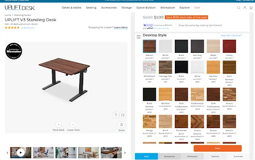
UPLIFT Desk is a leader in ergonomic office furniture, known for its highly customisable standing desks, ergonomic chairs, and accessories. As one of the fastest-growing brands in its category, UPLIFT Desk prioritises innovation and a seamless shopping experience.
In 2016, UPLIFT Desk replatformed to BigCommerce, seeking a more scalable and flexible ecommerce solution. This transition resulted in remarkable improvements, including a 226% increase-in-orders, a 61% increase in conversion rates, and a 203% increase in customers.
With so many personalisation options and add-ons, UPLIFT Desk has prioritised its unique and interactive product configurator, or “desk builder” feature, on desk-product listings. In addition to offering customers a fully customisable desk with accessories when shopping, buyers can see their desk come to life as they navigate and select the features they want in their setup.
Shoppers also get to preview high-resolution swatches as they work their way through the desk builder, allowing them to view a wide variety of woodgrains and desktop sizes. The ergonomic brand streamlines assembly by offering quick, easy-to-follow installation videos.
SportsShoes.com.
SportsShoes.com is the largest sports and outdoor wear retailer, dedicated to helping every adventurer and athlete go faster, further, and higher. Its “no fun standing still” motto captures the high energy behind the brand, which partners with more than 150 companies to offer over 15,000 products.
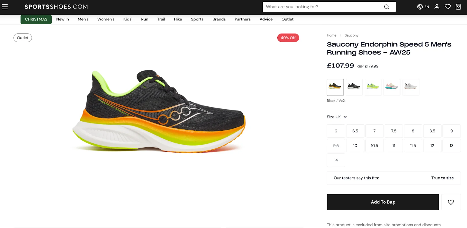
Due to their large product catalogue, categories are key in making sure shoppers know which style of shoes they see. There are simple tabs that call out Men’s, Women’s, and Kids’ shoes, in addition to Run, Trail, Hike, etc.
SportsShoes.com makes sense of a large amount of information, but in a clean, design-focused way. Large, high-resolution images display products from all angles, and a short overview is found just under the fold of the product page’s design. The “Best for…” sections near the overview quickly communicate features and use cases. For more info, accordion menus give lengthier product descriptions, reviews, features, tech specs, and delivery/return policies.
Brondell.
Brondell is an ecommerce company that transforms people’s daily routines into healthier experiences that put a focus on sustainability — with products like air purifiers, water filtration systems, bidets, and showers. The brand delivers innovation to both homes and high-traffic commercial spaces.
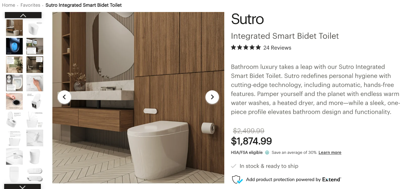
In line with its company ethos, Brondell has designed its product pages to mirror the same class and sophistication that their products offer. A gallery of high-resolution images, from in-situ photos to closeup shots that feature text calling out relevant features, allow shoppers to glean more about each product.
To the right of these photos is a quick overview section; beneath the overview, shoppers can find a list of features and benefits. When users scroll down the page, they get even more in-depth information about features, useful resources like installation videos and spec sheets. Near the bottom of the PDP is a collection of customer reviews and testimonials.
Tradelink.
Tradelink’s product pages feature multiple tabs that let customers toggle between the product description, item specifications, downloadable spec sheets, and the store’s return policy.
The site’s clean, simple interface features plenty of white space and prevents customers from having to continuously scroll to view product information.
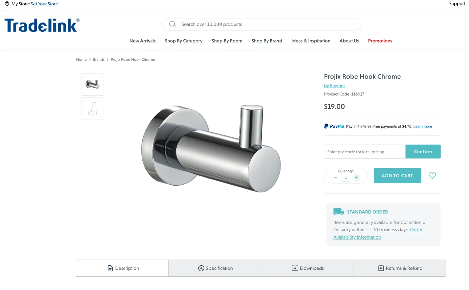
Tradelink customers can enter their zip code to calculate shipping fees before adding items to their cart, which provides price transparency and gives the option to pay in instalments.
Further down the page, under the heading “Need inspiration?”, is a section linking to buying guides and blog posts that show shoppers how to use Tradelink’s products in renovation projects and offer ideas to inspire them.
USCutter.
Known for its vinyl-cutting products, USCutter is a hybrid B2C and B2B business, serving both hobbyists and printing professionals. Consequently, its product page is straight-to-the-point and designed for an audience familiar with the product and its uses.
The top of the page highlights product features and lets customers choose the exact specifications they’re looking for (e.g., width and length). They can also see product availability, star ratings, and the percentage of customers that would recommend this product to a friend.
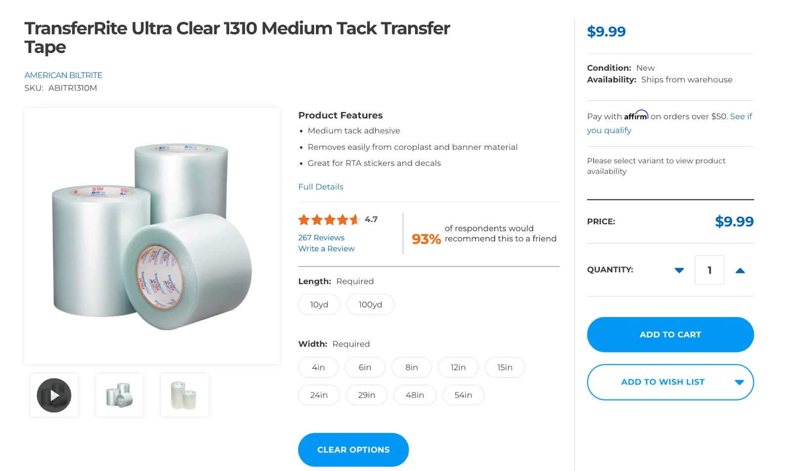
USCutter’s Customer Reviews section shows the highest-rated reviews, and lets users filter reviews by “pros” and “cons” of the product. The review section of this site’s design also allows shoppers to filter reviews.
Shoppers can also see the best uses for the product and the type of customer that bought the product (e.g., small business, budget shopper, professional, etc.), allowing them to search for feedback from buyers like them.
The final word
Your website is often your first interaction with a potential customer. So why not make a great first impression with a page that is visually appealing and easy to navigate? It’s clear when we shop online — not all websites are designed the same.
Brands must build trust with shoppers in seconds, and offer features that create confidence over time. With thoughtful product page design and offerings such as live chat, FAQs, and customer reviews, online stores can reduce bounce rates and abandoned carts. By providing essential information about products, retailers can help customers understand if it meets their needs.
Product pages are also a key source of referrals for search engines. Following SEO best practises ensures product pages serve as a gateway for customers to discover your brand and convert. With AI-led shopping and checkout on the rise, it’s more important than ever to write product info in a way that AI can understand, as well as search engines.
With the right ecommerce platform on the back end, you can start building trust on the front end. All it takes is a support team who’s ready to help you win.
FAQs about product page examples
Product pages are an invaluable revenue generator, providing customers with detailed product information and the best CTA needed to complete a purchase.
The information on a product page ensures customers have a clear understanding how to buy what they want, thereby reducing the likelihood of returns. Product pages also provide SEO benefits by targeting specific keywords and phrases customers are searching for, which helps ecommerce sites with organic traffic.
A landing page and a product page are two types of web pages with distinct purposes and features. A landing page is designed to capture leads or prompt visitors toward a specific conversion goal, such as signing up for a newsletter, or joining a loyalty programme.
On the other hand, a product page shows and sells a product, the purpose of which is to provide visitors with detailed information about a product, including its features, specifications, and price to persuade them to make a purchase.
It is generally not recommended to use a product page as a landing page. Product pages focus on one product. They are optimised to provide a smooth and seamless buying experience for customers who are interested in that product.
While there may be some overlap between the content and design of a landing page and a product page, it’s generally more effective to keep them separate and use them for their intended purpose.
Product pages should be concise without omitting necessary product information. However, the ideal length depends on the item’s complexity and its target audience.
If customers require extensive education on the product, provide links to supporting materials such as knowledge articles, whitepapers, or a user manual to avoid cluttering the product page.
Long or dense product pages are difficult to read and navigate, which could reduce conversion rates. Use headings, bullet points, and other formatting tools to break up the text and enhance your readability.
High-converting product pages typically contain a well-crafted product description, high-quality images or videos, clear call to action, customer reviews, trust signals (such as security badges or an ssl certificate), pricing details and mobile-friendly design. Focusing on these elements helps ensure your product page captures attention, will be easy to navigate, and encourages conversions.
With more consumers using their mobile devices to shop, optimising your product page is critical to providing a successful shopping experience. Pages that are optimised for mobile load faster, are easier to navigate, and usually have minimal steps to conversion.
The layout for a brand’s product page must take into consideration things like product complexity, what types of product images to include, whether the design should be focused on desktop or mobile, and where shoppers are making the purchase (computer or smartphone).
It’s important to consider how a page will balance and display visuals and product copy together too. Some products can leverage full-width hero images that catch your eye, while others use images that show which item to use. This gives a better idaea of how it will assimilate into the user’s space.
Since many page designs must make sense and organise lots of information, it can help to include features like gallery carousels for images, tabbed sections for components with longer product overviews, product specs, and customer reviews.
Since “above-the-fold” information on a page is seen first, it helps to follow a few best practises when designing product pages.
Consider the features that best sell your product, such as a hero image, headline, or easy-to-understand lists of features and benefits. If having user-submitted content helps, social proof like images of customers using products and curated customer testimonials are good options to include up top.
If your product is more complex or would be best seen in a more immersive product experience, a product configurator can be a great feature to implement.
Make it seamless for customers to buy your products. Clearly display prices and offer a checkout option or “Buy Now” button where it’s easy to see. For urgent sales messaging, you can include a banner at the top or even a popup in the corner of the screen to draw attention to limited-time messaging.
As shopping has evolved to happen more on the smartphone, mobile optimisation is key to making sure shoppers have as good of an experience navigating your site on a phone as they would a computer.
A smaller screen means less real estate for websites; luckily there are things like thumb-friendly buttons and collapsible sections to make better use of space. Load speed is a huge factor in determining whether a customer stays on your site or bounces, so prioritising load speed is another important factor to consider. Businesses do this by building sites on ecommerce platforms with quick load times, and by reducing file sizes where it matters.
Consider how much scrolling a page requires to find relevant information, and avoid including so much info that the shopper is scrolling nonstop. Strategise on what information is important enough to include above-the-fold, and hide non-critical details near the bottom of the page.
Since mobile sites have to make use of such limited space (but still convey a wide variety of info), it helps to include images like large, detailed swatches of product variants. This is especially the case for product categories like clothing, shoes, and furniture.
Many products have variants on the same item — like size or colour — which means they should be included on the same listing. When designing your ecommerce website, there are a few design considerations and UX flows to think about — including how to handle product variants in a way that doesn’t negatively affect page performance or load time.
For simple variants like material or colour, swatches make a great option for brands looking to show more detailed product images with different variants. When imagery is less important and variants reflect dimensions or size, drop down menus can convey more information in less space.
Variant selector tools and configurators let shoppers see live previews of the product change on screen — with prices and images updating automatically. It helps to build your site on a platform that supports tools that can be integrated into the page design.
When testing multiple variations of a landing page or product page, think about your strategy. How can you offer a different experience for your target audiences while still staying in line with your brand identity and brand values?
A few tips if you want to A/B test your design:
Should you include a hero image, or would a video make more sense and be a better use of space? It’s time to test it out!
Does your product listing need to convey a lot of information? Or can you be sure using product images and swatches? This can help you determine the need for long vs. short copy. Make a version of each and see which performs better.
Call-to-actions can be via sticky buy bar (which follows the page as a user scrolls), or you can keep your CTA standard. You may want to test this, too!
Does the shopping experience feel better if all info is displayed on a single page? Or have you tried organising and revealing sections on tabbed specs? This is another great thing to experiment with.
Data is key, so it’s important when A/B testing that you can keep tabs of metrics like bounce rate, add-to-cart rate, and conversion rate. It helps when analysing conversion rate optimisation (CRO) metrics to have a guide with tips and tricks to stay on track.
Social proof can either add or detract from a product page’s authority, which is why it’s important to consider when designing.
Start with where the placement should be. If social proof is big in your customer community or if you’re just getting started, you may want to include user-submitted photos higher on the page. If they’re high-quality enough (and you get permission from the creator), you may be able to include it in your product photo gallery.
User-submitted photos of products can show the product in different use cases, or even display product variants in the real world. Consider the quality of the content and how to incorporate it into your page in a way that establishes trust and doesn’t distract from conversion.
High-rated and informative product reviews can also be optimised to show social proof. One option is to curate the best testimonials and feature them. Another option is to use a third-party review app to help you organise customer testimonials, giving them their own section on the site.
Well-designed product pages have the opportunity to upsell and even cross-sell other products. Depending on the item, you may be able to share similar products on the same page, offering a few options in a category to click through and view.
If you think shoppers may want to view more products, a separate section of “You May Also Like” product listings can be created to keep shoppers informed and engaged on the page.
Think about whether the product page should include a way to bundle products or accessories. This makes sense in product categories like office furniture, tools, and hardware.
Placement of other products on the page is important, as is maintaining focus on your “Add to Cart” button. You never want to distract or overwhelm a customer who has already found the product they want. Consider the visual hierarchy of elements on the page and when in doubt, test it out!

There's a lot to love ❤️
Watch a demo to see the BigCommerce platform in action.
